My Work | Branding
Makwa Carpentry
Logo Design, Stationary Package, Vehicle Wraps
Project Context
I was approached by a new start-up business, Makwa Carpentry & Exteriors, to create a logo for the business. Makwa is an indigenous owned and operated business, specialize in siding, soffit, fascia, roofing/repairs, aluminum capping, decks/fences, flooring , drywall/repairs, windows, doors, trim and other interior & exterior Reno’s. The word Makwa, means Bear in Algonquin.
The request was to create a logo that incorporated an image of a bear, as well as houses. There was also a request, that if possible, also pay special tribute to the owner’s wife and two-daughters, who were key to the inspiration behind starting the business.
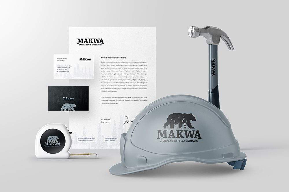
In addition to the logo design, they requested a few inspirational mock-ups for the logo ‘in-use’ on things like stationary and vehicle wraps.
Design Method
We had an initial kick-off meeting exploring how Makwa works, services offered, the ties to indigenous roots, their competitive landscape, partners, goals, how and where the logo would be used, and more.
I compiled an initial list of questions for Makwa to answer that helped me further understand the goals for their logo. After the questionnaire was completed I created a presentation that was shared with the owner. This included various styles of logos, fonts styles and colour pallets allowing me to further hone in on the direction before getting started.
Design Solution
Step 1: As with the majority of my logo work, my process starts with rapidly sketching out very top level concepts – anything goes, just get it out my head and onto paper and cover as many different options as possible while only working in black and white while keeping colour in mind.
Step 2: I presented to logo concepts and rationale behind them, and once I received buy in on one of my concepts, I switched to finessing the logos and colour options, with colours that were vetted for accessibility compliance. I presented two different colour palettes based off of my initial discovery phase.
Step 3: After receiving approval on the finalized logo & colour options, I then created asset mockups using a combination of licensed pre-made product mock-up templates and photoshopping other elements from scratch.


Design Solution
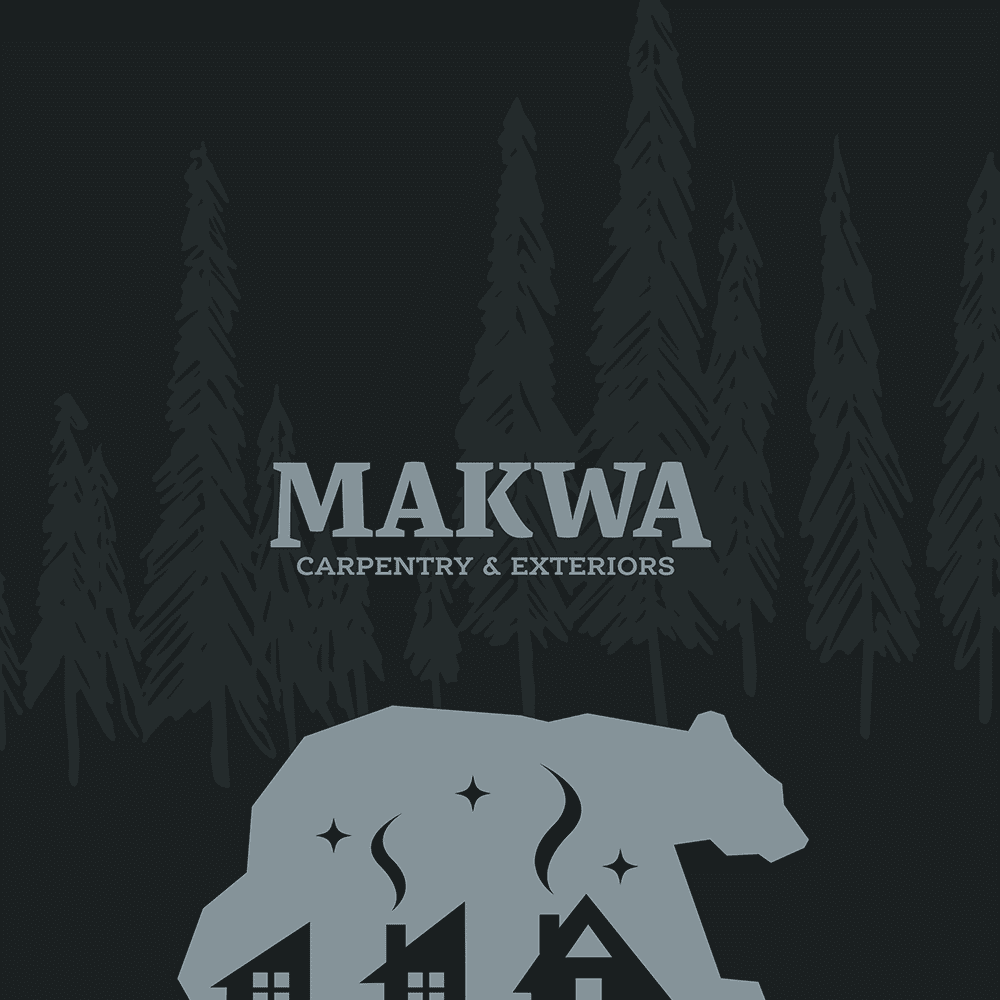
Given the graphic complexity of the request, I opted for a simplified drawing style that related to some of the indigenous-rooted inspiration images that were shared with me during the discovery phase. This simplified drawing style also allowed me to create a logo that was easily identifiable, rather than getting into a complex illustration of a bear.
The silhouette of the walking bear was drawn using straight lines, symbolizing the rigidness and strength of the bear. The house shapes were formed out of the counter shapes between the legs, with the bear acting as both the creator, and guardian of the homes. The chimneys and smoke were added to symbolize the comfort, warmth and peace of mind that Makwa provides their clients. The silhouette of the black bear also acted as a backdrop of the night sky, symbolizing that Makwa’s clients can rest/sleep easy with assurance that Makwa has their concerns covered. The 3 stars in the sky are a special nod to the owners’ request of incorporating a reference to his wife and daughters being a key inspiration for the business – the guiding stars.
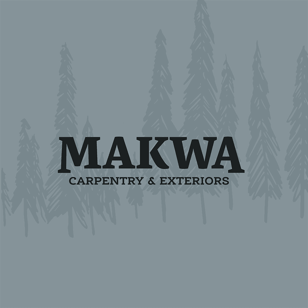
The fonts were chosen for a variety of reasons – including versatility of the various font weights, visual balance with the bear icon, the straight lines and curves that relating to the work Makwa creates, and also conveying a bold and brave, yet comforting and inviting, well balanced feeling.