My Work | Branding
CanDance Network
Logo and Visual Identity Guidelines
Project Context
CanDance Network approached me to create a new and improved logo and visual identity guidelines. They wanted the logo to be clean, with a more corporate feel. They specifically did not want the logo to visually represent a dancer, but to play more on the concept of them being a connector.
Design Method
– Reviewed clients website and had initial kick-off meeting exploring how the CanDance Network works, their competitors, partners and more.
– Compiled an initial list of questions for CanDance to answer that help me further understand their current brand & goals of their new brand, including things like – describe the essence of CanDance to a professional, and to a friend. What do you like about your current logo/brand, what don’t you like, why do you want a new logo, etc.
– After the questionnaire was completed I created a presentation that was shared with the Board of Directors. This included various styles of logos, fonts styles and colour pallets allowing me to further hone in on the direction before getting started.
– CanDance also compiled and shared a presentation of logo styles that they liked, narrowing in on the stylistic direction of their future logo.
Design Process
As with the majority of my logo work, my process starts with rapidly sketching out very top level concepts – anything goes, just get it out my head and onto paper and cover as many different options as possible while only working in black and white while keeping colour in mind. From there, I narrowed things down and picked my top concepts to present to Candance, who then narrowed things down to their favourite concecpt.
Once I received buy in on the concept I shifted gears into finessing and finalizing the logo and after receiving approval on the logo, dove into brand colour options, vetting colours to ensure they were compliant with accessibility standards.
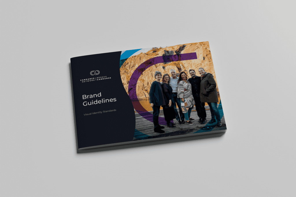
After receiving buy-in on the colour options, I went to work creating and finalizing the 38 page brand guideline.
Design Solution
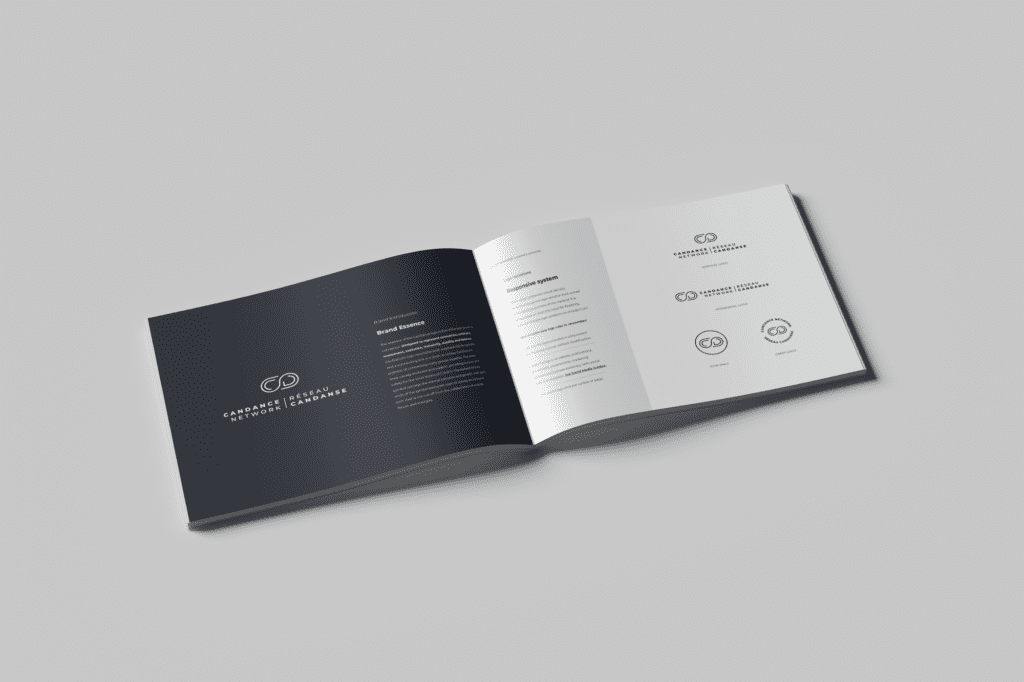
The essence of the CanDance logo is that of the ever growing connector. Designed to represent connection, embrace, movement, evolution, inclusivity, stability and balance. CanDance’s logo resembles both a stylized infinity symbol, and a connecting link in a chain, to convey CanDance’s position of connecting many groups together. The outer lines convey embrace and support, providing nurture and safety for the inner letters of C and D. The stylized infinity symbol conveys the eternal evolution and growth, with both ends of the symbol being left open to convey an inclusive icon that is not cut off from the collaboration of outside forces and energies.
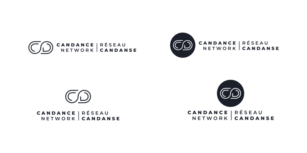
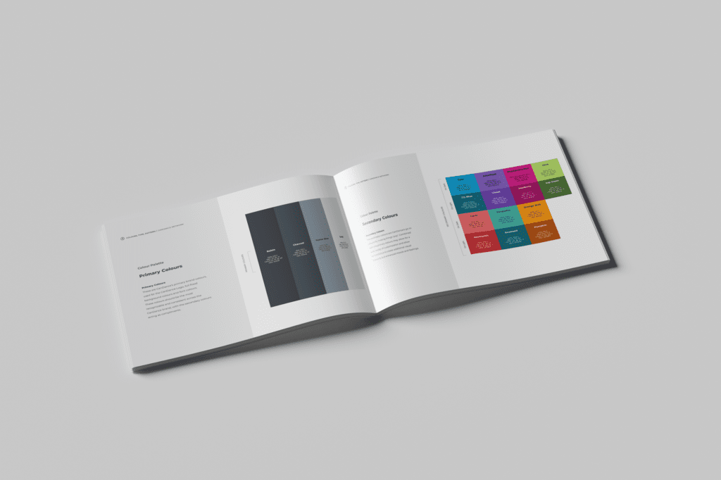
The brand guideline included sections for the brand mission/values (developed by CanDance), logo essence, logo variations, colour and typography standards, reproduction standards and generic social media guidelines.