Case Study
Creating a logo and brand foundation for Makwa Carpentry
Client: Makwa Carpentry
Role: Direction & Design
Deliverables: Logo design & collateral
Case Study
Creating a logo and brand foundation for Makwa Carpentry
Client: Makwa Carpentry
Role: Direction & Design
Deliverables: Logo design & collateral
The challenge
Create a bold, trustworthy brand for Makwa that honors family and Indigenous roots while standing out in home renovation.
Makwa is an Indigenous-owned and operated business specializing in a wide range of residential and commercial renovation services, including siding, soffit, fascia, roofing and repairs, aluminum capping, decks and fences, flooring, drywall and repairs, windows, doors, trim, and other interior and exterior renovations. The name Makwa, which means Bear in Algonquin, reflects the strength, reliability, and grounded nature of the business while honoring Indigenous heritage.
The client requested a logo that integrates the image of a bear alongside residential elements such as houses to communicate the company’s focus on home renovations. The design is also meant to pay tribute to the owner’s wife and two daughters, who were a major inspiration behind starting the business, creating a personal and meaningful connection in the brand identity.
Along with the logo design, the project included creating inspirational mock-ups to show the logo in context on stationery, business cards, vehicle wraps, and other branded materials. The goal was to craft a visual identity that is strong, approachable, and rooted in family values and cultural heritage while clearly communicating professionalism in the renovation industry.
Discover & Define
Researched culture, competitors, and services. Gathered insights from the client to guide logo, typography, and colour strategy.
The Discover & Define phase began with an initial kick-off meeting to explore how Makwa operates, the full range of services offered, and the deep ties the business has to Indigenous roots. During this session, we discussed the competitive landscape, key partners, long-term goals, and how and where the logo would be applied, including signage, stationery, and vehicle wraps. This conversation provided essential context to inform the design strategy.
To gain a deeper understanding of the client’s vision, I compiled a comprehensive list of questions for Makwa to answer. These questions focused on brand values, personal inspirations, target audience, and practical considerations for logo use. Once completed, the responses offered clear insights into the goals for the logo and the story the brand wanted to communicate.
In addition to gathering client input, I conducted research into Indigenous symbolism and cultural references to ensure the logo would be respectful and meaningful. This included exploring the significance of the bear in Algonquin culture and how this symbolism could be integrated visually. I also performed a competitive analysis of similar renovation and construction companies, identifying common design trends, strengths, and opportunities to help Makwa’s brand stand out in the market.
With these insights, I created a presentation for the owner that showcased a range of logo styles, font options, and colour palettes. This presentation allowed the client to see different creative directions and provided a foundation to refine the design approach before moving into concept development.
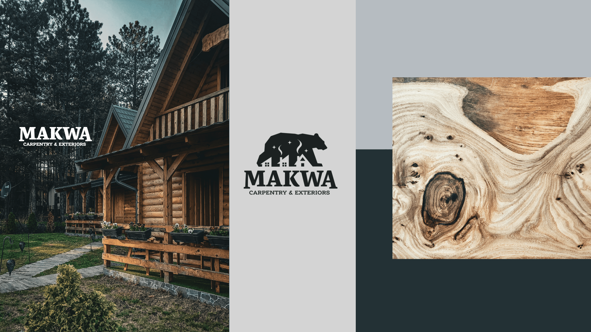
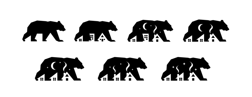
Concept & Direction
Rapid sketches explored bears, homes, and symbolism. Final logo reflects guardianship, warmth, and family inspiration.
The Concept & Direction phase focused on generating creative directions that were both meaningful and strategically aligned with Makwa’s brand. As with most of my logo work, I began with rapid sketching to explore a wide range of high-level concepts. The goal at this stage was to capture every idea, no matter how rough or unconventional, in black and white to focus on form, composition, and concept while keeping potential colour applications in mind. This approach allowed me to quickly explore multiple directions and identify the strongest visual ideas.
From these initial sketches, I selected the most promising directions and presented two logo concepts to the client along with the rationale behind each. Each concept was carefully considered to reflect Makwa’s brand values, Indigenous heritage, and market positioning. After feedback and approval on the preferred concept, I refined the logo details and explored colour options. Two distinct colour palettes, informed by the discovery phase, were presented and vetted for accessibility compliance. This ensured the brand colours would be versatile, legible, and effective across all applications.
Given the complexity of the brief, I opted for a simplified drawing style inspired by Indigenous-rooted reference images shared during discovery. This approach allowed for a logo that is easily recognizable and versatile while maintaining cultural and personal significance.
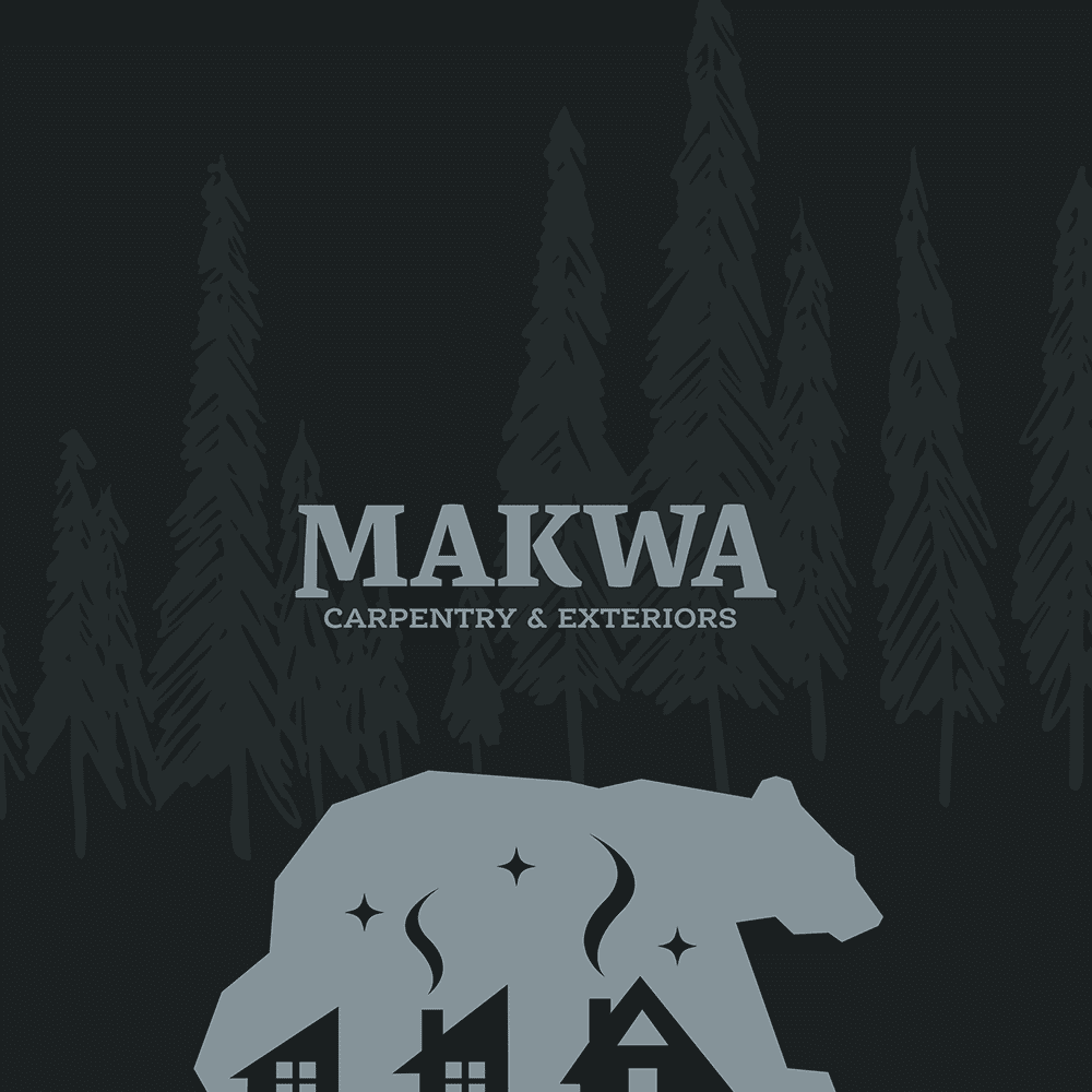
The walking bear silhouette was drawn using straight lines to symbolize strength and stability. House shapes were formed from the counter shapes between the legs, representing the bear as both creator and guardian of homes. Chimneys and smoke were included to symbolize warmth, comfort, and peace of mind. The black bear silhouette also serves as a backdrop for the night sky, symbolizing that Makwa’s clients can rest easy knowing their concerns are covered. Finally, three stars were added as a subtle tribute to the owner’s wife and daughters, serving as guiding stars and inspiration behind the business.
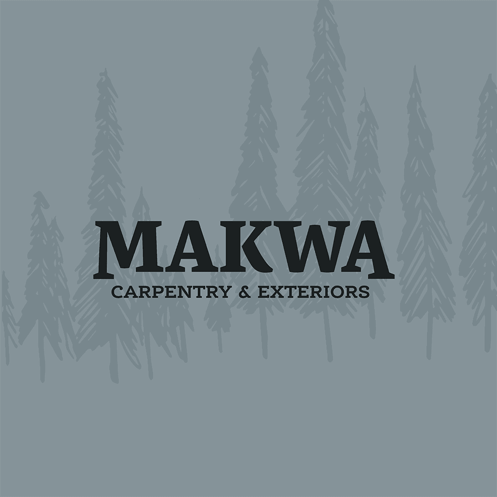
The fonts were chosen to complement the bear icon while reflecting Makwa’s work: bold and brave, yet comforting and inviting. The variety of font weights and the balance of straight lines and curves convey versatility and professionalism while maintaining visual harmony with the logo.
Concept & Direction
Rapid sketches explored bears, homes, and symbolism. Final logo reflects guardianship, warmth, and family inspiration.
The Concept & Direction phase focused on generating creative directions that were both meaningful and strategically aligned with Makwa’s brand. As with most of my logo work, I began with rapid sketching to explore a wide range of high-level concepts. The goal at this stage was to capture every idea, no matter how rough or unconventional, in black and white to focus on form, composition, and concept while keeping potential colour applications in mind. This approach allowed me to quickly explore multiple directions and identify the strongest visual ideas.
From these initial sketches, I selected the most promising directions and presented two logo concepts to the client along with the rationale behind each. Each concept was carefully considered to reflect Makwa’s brand values, Indigenous heritage, and market positioning. After feedback and approval on the preferred concept, I refined the logo details and explored colour options. Two distinct colour palettes, informed by the discovery phase, were presented and vetted for accessibility compliance. This ensured the brand colours would be versatile, legible, and effective across all applications.
Given the complexity of the brief, I opted for a simplified drawing style inspired by Indigenous-rooted reference images shared during discovery. This approach allowed for a logo that is easily recognizable and versatile while maintaining cultural and personal significance.
The walking bear silhouette was drawn using straight lines to symbolize strength and stability. House shapes were formed from the counter shapes between the legs, representing the bear as both creator and guardian of homes. Chimneys and smoke were included to symbolize warmth, comfort, and peace of mind. The black bear silhouette also serves as a backdrop for the night sky, symbolizing that Makwa’s clients can rest easy knowing their concerns are covered. Finally, three stars were added as a subtle tribute to the owner’s wife and daughters, serving as guiding stars and inspiration behind the business.
The fonts were chosen to complement the bear icon while reflecting Makwa’s work: bold and brave, yet comforting and inviting. The variety of font weights and the balance of straight lines and curves convey versatility and professionalism while maintaining visual harmony with the logo.


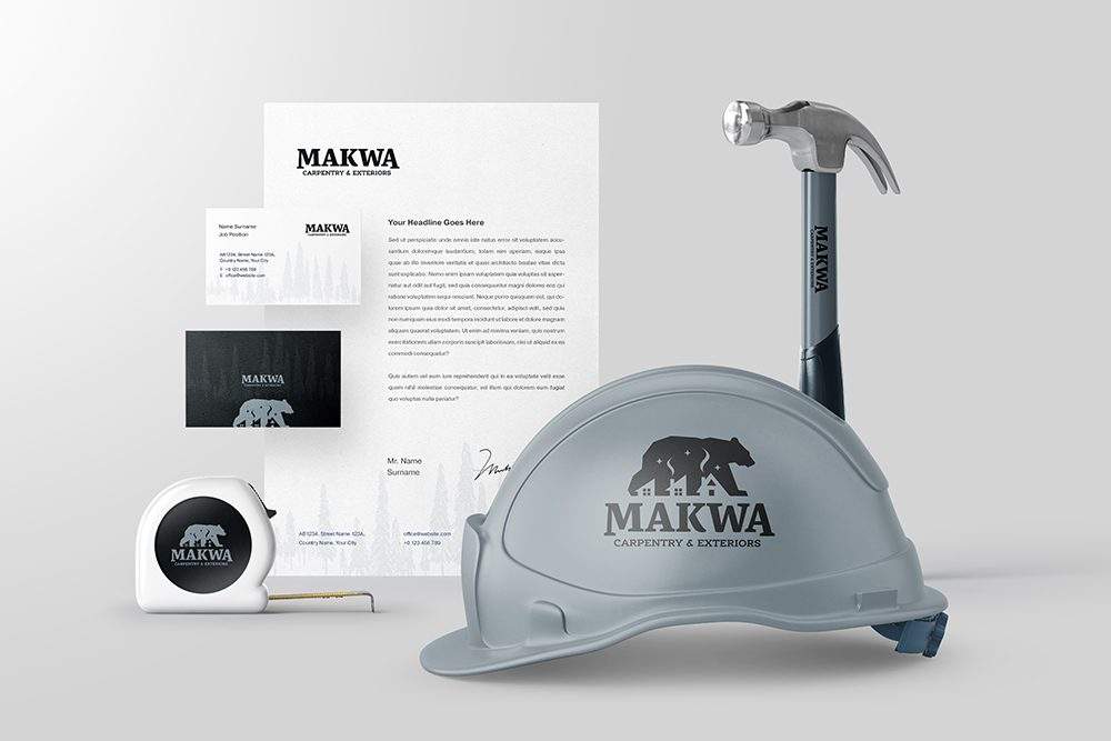
Design & Develop
Applied logo across stationery, vehicles, and marketing. Colour, typography, and mockups ensured clarity, versatility, and impact.
After finalizing the logo concept and colour palette, the Design & Deliver phase focused on bringing the brand to life across real-world applications. I created a series of asset mockups to demonstrate the logo in context, including stationery, business cards, vehicle wraps, and other branded materials.
Mockups were produced using a combination of licensed pre-made templates and custom Photoshop edits to accurately reflect how the brand identity would function in practice. This stage allowed the client to see the logo’s versatility, readability, and impact across multiple touchpoints, confirming the strength and cohesion of the visual identity.
By the end of the Design & Deliver phase, Makwa received a complete, fully-realized brand identity that is meaningful, culturally informed, and practical for a wide range of applications. The result is a logo and visual system that is strong, approachable, and resonant with both the client’s values and their target audience.