Case Study
Creating a logo and brand foundation for Kingston School of Dance.
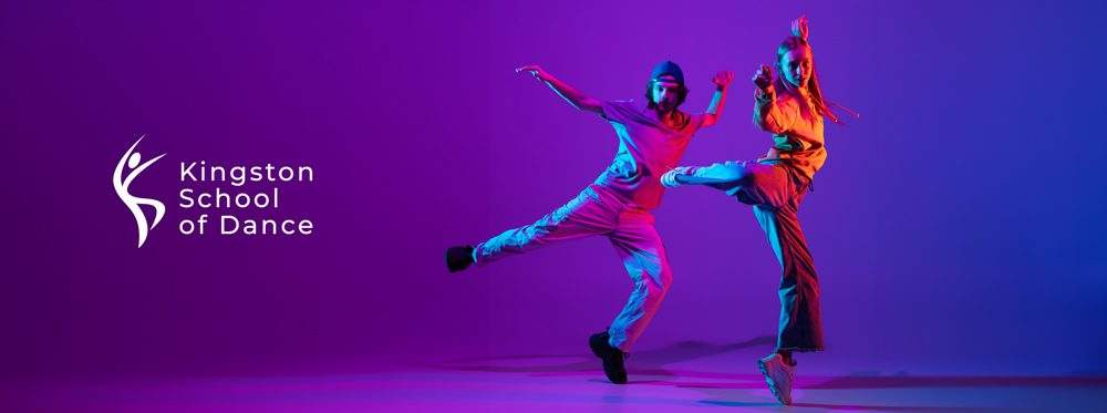
Client: Kingston School of Dance
Role: Direction & Design
Deliverables: Logo design & activations
Case Study
Creating a logo and brand foundation for Kingston School of Dance.
Client: Kingston School of Dance
Role: Direction & Design
Deliverables: Logo design & activations
The challenge
Kingston School of Dance approached me to create a new and improved logo to be launched at their 50th anniversary.
Kingston School of Dance approached me to create a new and improved logo to be launched at their 50th anniversary. They wanted the logo to be clean, abstract, and to visually represent movement and dance. They also wanted it to pay visual homage to their original logo from 50 years ago.
Discover & Define
Understanding the brand essence.
Read through the entirety of the KSD website to gather as much information about the school as possible before conducting a detailed Q&A session with the key stakeholders at KSD staff, followed up with independent industry research to review the following:
– Competitors and industry analysis
– Concerns and challenges with existing logo
– KSD’s service offerings and key differentiators
– Review of the KSD services and types of dance education
– Goals for new brand and vision for the companies future
– Determined what is important to their customers/students and what types of people provides services to.
– Prepared mood boards including a variety of logo styles, colour palettes and font styles to get a feel for what they did or did not like and why.
Concept & Direction
From concept to creation.
As with the majority of my logo work, my process starts with rapidly sketching out very top level concepts – anything goes, just get it out my head and onto paper and cover as many different options as possible while only working in black and white while keeping colour application in mind. From there, I narrowed things down and picked my top 5 concepts to flesh out into something more digestible to share with KSD’s Board of Directors for conceptual direction buy-in.
The board of directors unanimously decided on one of the concept directions, and at that point I shifted gears into finessing the logos and colour options. The variety of colour palettes were based off of my initial discovery phase – with each evoking a different underlying tone and feeling. The Board of directors decided to remove any colour from the logo and stick with the black and white logo I had originally pitched + a slate grey. The final logo was unanimously approved.
Design & Develop
The final logo design.
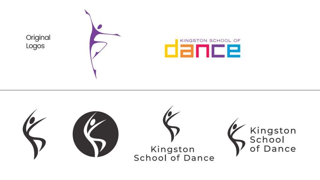
– I was able to incorporate elements of their original logo into the design, using abstract shapes that resembled a dancer moving.
– I used more fluid and curved lines than their original logo to bring a more abstract approach.
– I was able to create a hidden nod to an acronym of Kingston School of Dance (KSD) which gets used very often in conversation about the school.
– The dancer icon was designed in a way that it not only represented abstract dancer movement, but that is was composed of abstract letters, that read KSD depending on how you looked at it. The abstract capital letter K is seen when looking at the icon as a whole. The abstract capital letter S is seen when looking at the right side of the icon, and the abstract capital letter D is seen when looking at the lower half of the dancer.
Design & Develop
The final logo design.
– I was able to incorporate elements of their original logo into the design, using abstract shapes that resembled a dancer moving.
– I used more fluid and curved lines than their original logo to bring a more abstract approach.
– I was able to create a hidden nod to an acronym of Kingston School of Dance (KSD) which gets used very often in conversation about the school.
– The dancer icon was designed in a way that it not only represented abstract dancer movement, but that is was composed of abstract letters, that read KSD depending on how you looked at it. The abstract capital letter K is seen when looking at the icon as a whole. The abstract capital letter S is seen when looking at the right side of the icon, and the abstract capital letter D is seen when looking at the lower half of the dancer.