Case Study
Elevating the brand identity of the Dance Umbrella of Ontario.
Client: Dance Umbrella of Ontario (DUO)
Role: Direction & Design
Deliverables: Logo, Brand Identity & Guidelines.
Case Study
Elevating the brand identity of the Dance Umbrella of Ontario.
Client: Dance Umbrella of Ontario (DUO)
Role: Direction & Design
Deliverables: Logo, Brand Identity & Guidelines.
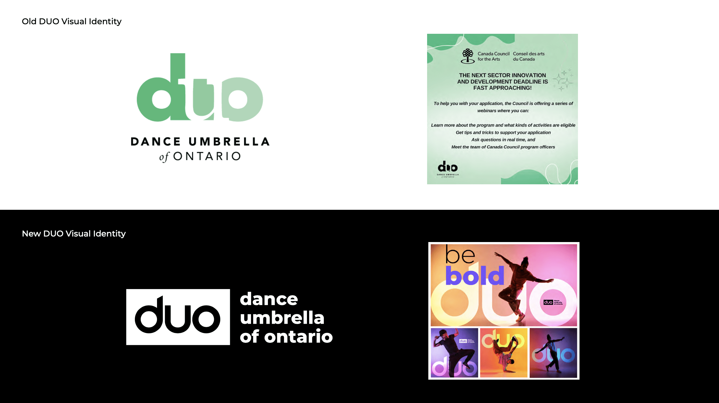
The challenge
Refreshing DUO’s legacy identity to match its vibrant, inclusive, professional brand essence and evolving role in the dance sector.
Dance Umbrella of Ontario is a long-standing, sector-shaping organization that supports the professional dance community through management services, strategic initiatives, and creative guidance. With a history dating back to 1988, DUO had built a reputation of trust and dependability—but its visual identity no longer reflected its ambition, vibrancy, or the evolving needs of Ontario’s dance sector.
The challenge was to create a modern identity rooted in DUO’s brand essence: confident but not arrogant, creative but professional, inclusive but focused, and always grounded in the balance between business and artistry. The renewed identity needed to reflect their mission to strengthen dance enterprises, their vision to foster innovation and excellence, and their values—teamwork, accountability, innovation, boldness, and balance.
Ultimately, the goal was to design a flexible, dynamic brand system that could confidently anchor the organization while accommodating the wide range of digital, community, and program-based environments DUO works within.
Discover & Define
Uncovering DUO’s mission, values, audience needs, and brand essence to form a clear foundation for a modern identity system.
To build a fully aligned identity, I began by examining DUO’s core operational pillars, reviewing their mission, vision, values, tone, and the emotional qualities that the brand must consistently convey. The guidelines made it clear that DUO’s brand is defined not just by visuals, but by an ethos: professional, approachable, knowledgeable, confident, warm, and inclusive.
Through analysis of their services, audience types, communications, and competitive context, several strategic needs emerged:
Clarity of purpose: DUO’s role as a management services provider must show up clearly and confidently in its visual system.
Expressive visual energy: The brand should communicate creativity, motion, and vibrancy to reflect the artistry of the sector.
Structure and professionalism: The identity must support the administrative, strategic, and organizational side of the work.
Consistency across platforms: DUO needed an identity system that provides clear rules, responsive logo variations, and scalable usage.
This stage created a defined framework to ensure every creative decision aligned with DUO’s essence: balanced, confident, vibrant, and community-rooted.
A screen shot of one of my art boards from my Concept & Direction Phase
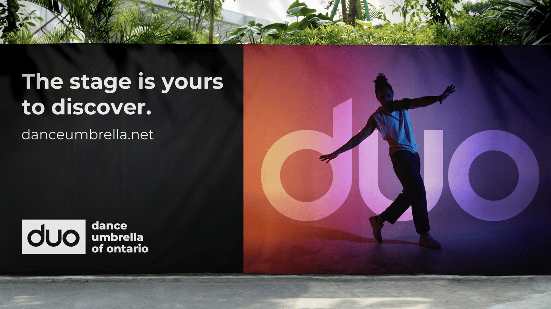
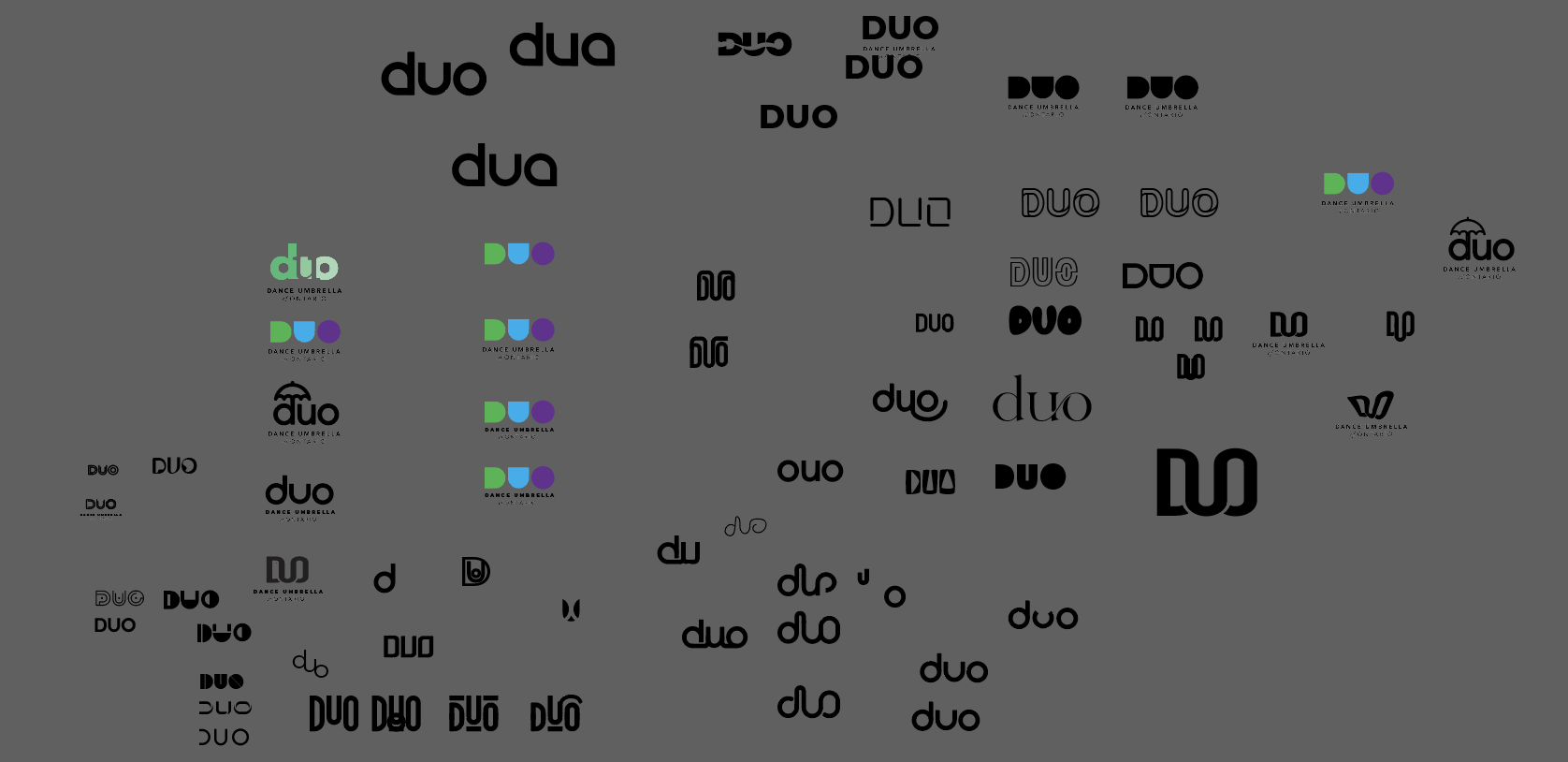
Concept & Direction
Exploring creative directions rooted in movement, community, and DUO’s confident, but approachable personality.
With the strategic foundation in place, I explored conceptual directions that visualized DUO’s unique position at the intersection of business and dance.
Three major themes guided the creative exploration:
1. Movement & Rhythm
Using the visual language of motion—flowing shapes, rhythm-inspired forms, and expressive contours that embody dance without relying on literal figures. This direction reflects DUO’s energetic, forward-moving vision.
2. Community & Collective Support
Concepts built around unity and connection, echoing DUO’s role as the anchor that strengthens artists, companies, and projects. Visual ideas in this space convey collaboration, shared growth, and interdependence.
3. Confident Professionalism
A more structured approach that balances vibrancy with administrative clarity. This aligns with DUO’s tone: confident but not arrogant, fun but not carefree, expert but not “know-it-all.”
Across all directions, the identity needed to represent DUO’s personality and values: bold, accountable, innovative, supportive, and deeply connected to the dance environment. These explorations shaped a visual direction that captured DUO’s essence while remaining adaptable across print, digital, and marketing contexts.
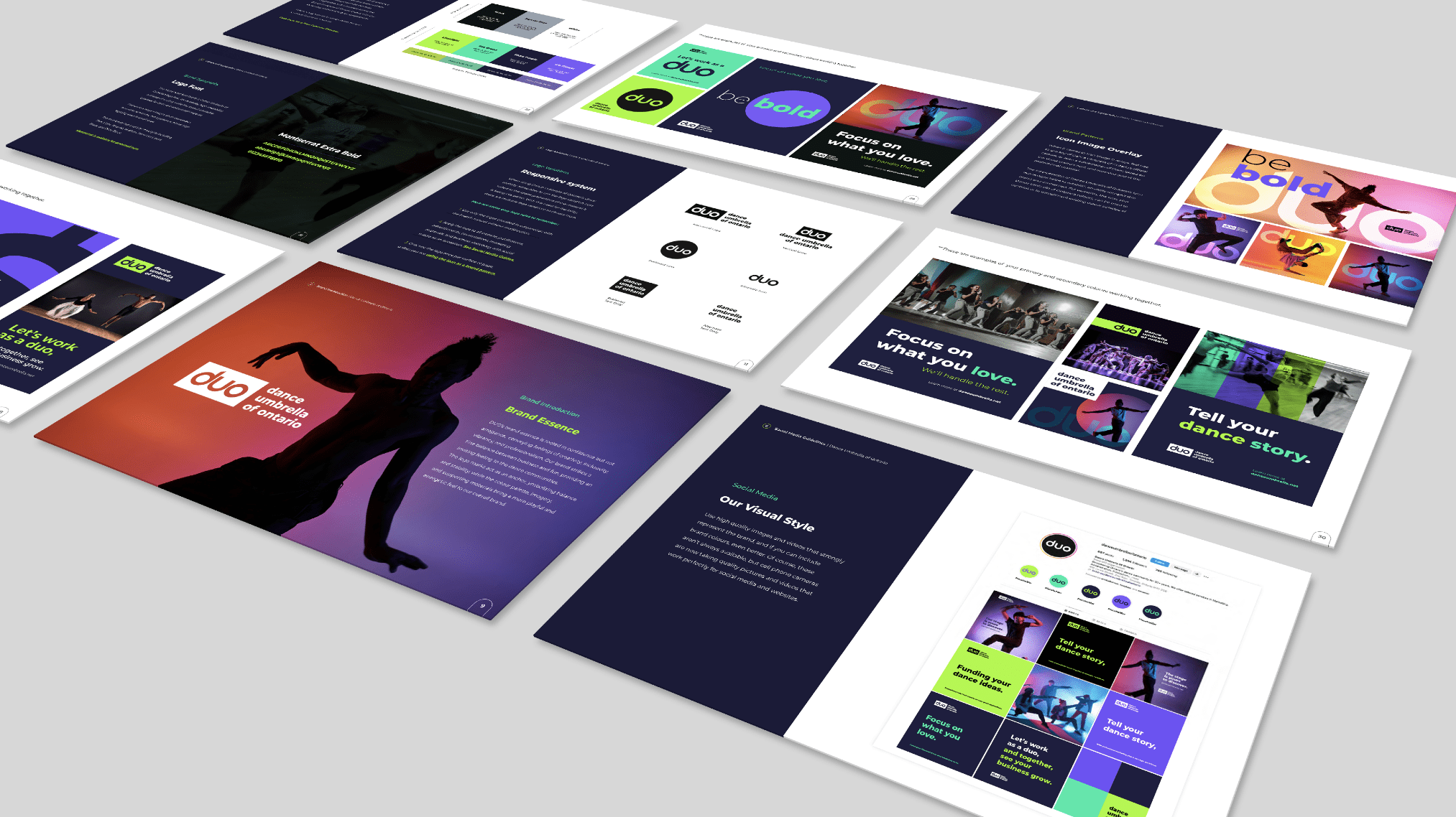
Design & Develop
Building DUO’s flexible visual system, including their logo suite, colour palette, typography, and motion-driven elements for consistent use.
From the approved direction, I developed a full visual identity system aligned with both DUO’s strategic goals and the detailed standards outlined in the brand guidelines.
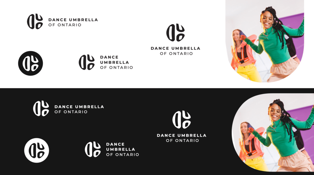
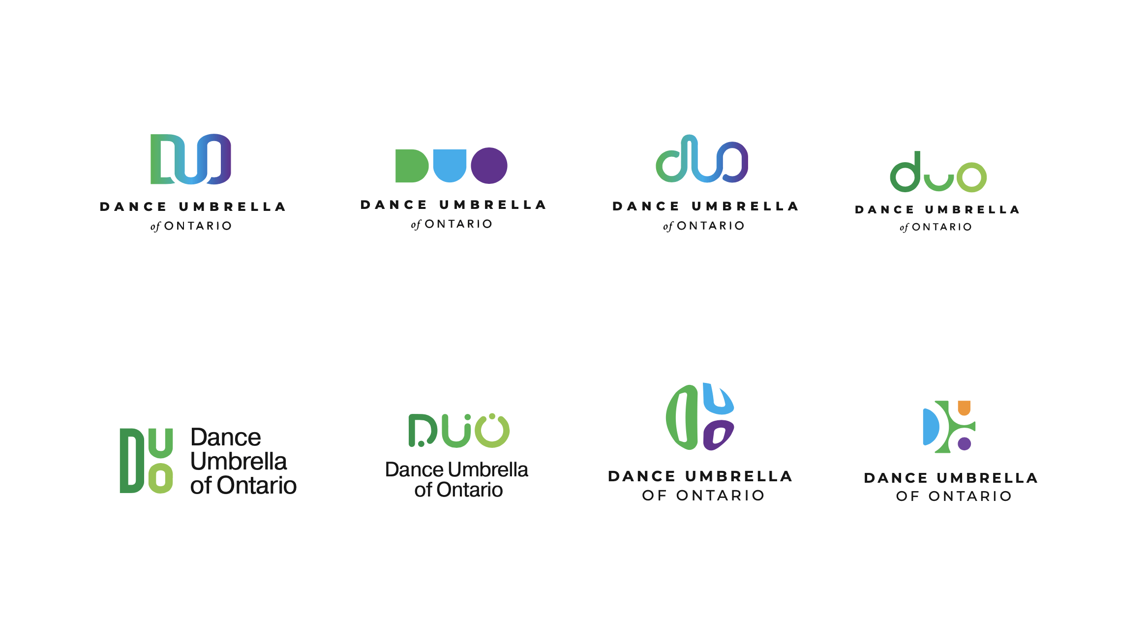
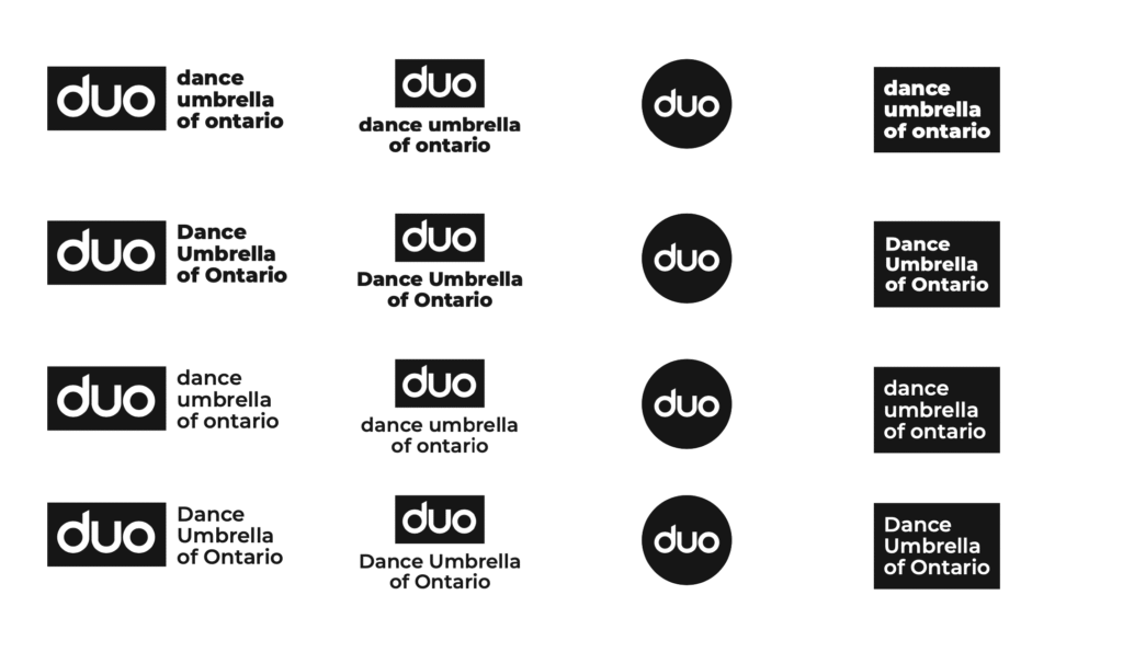
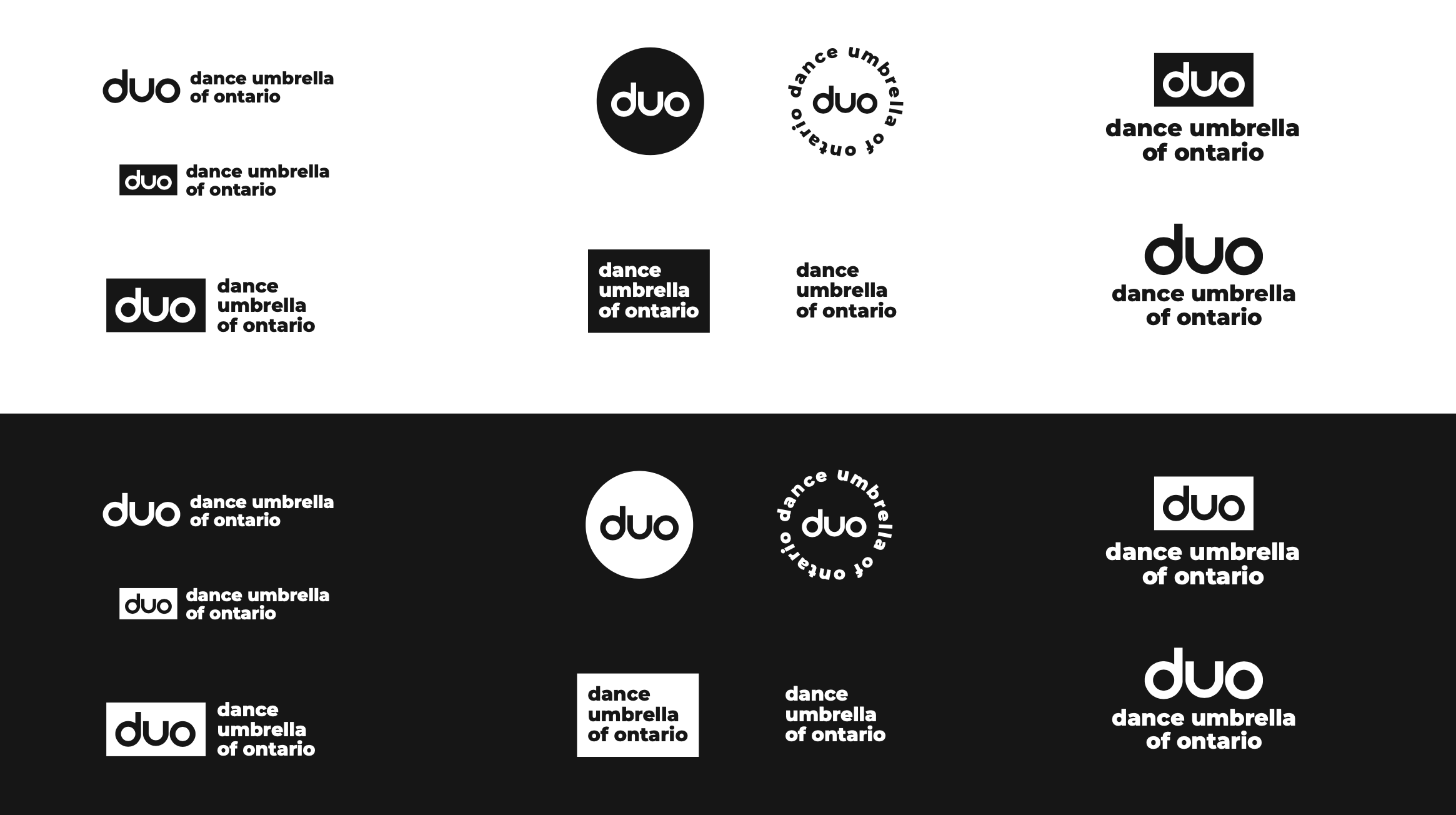
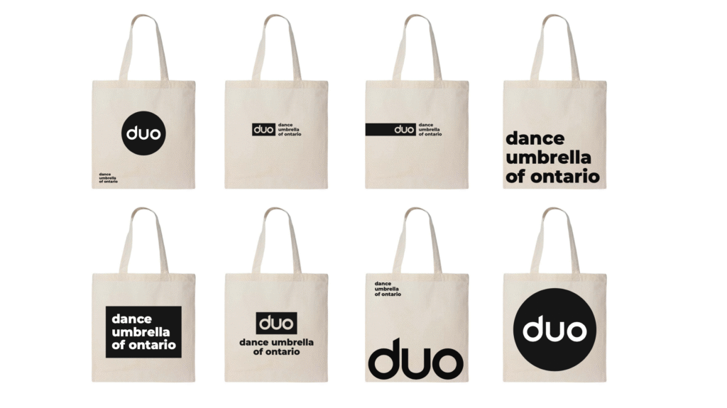
Logo System
A responsive suite of logos accommodating multiple environments:
Horizontal and vertical logos for structured applications.
Icon-only versions for social media, program visuals, patterns, and overlays.
Text-only logos for clarity-first use cases or small-scale applications.
Clearspace rules, contrast guidance, and usage dos and don'ts were established to maintain visual integrity across all materials.
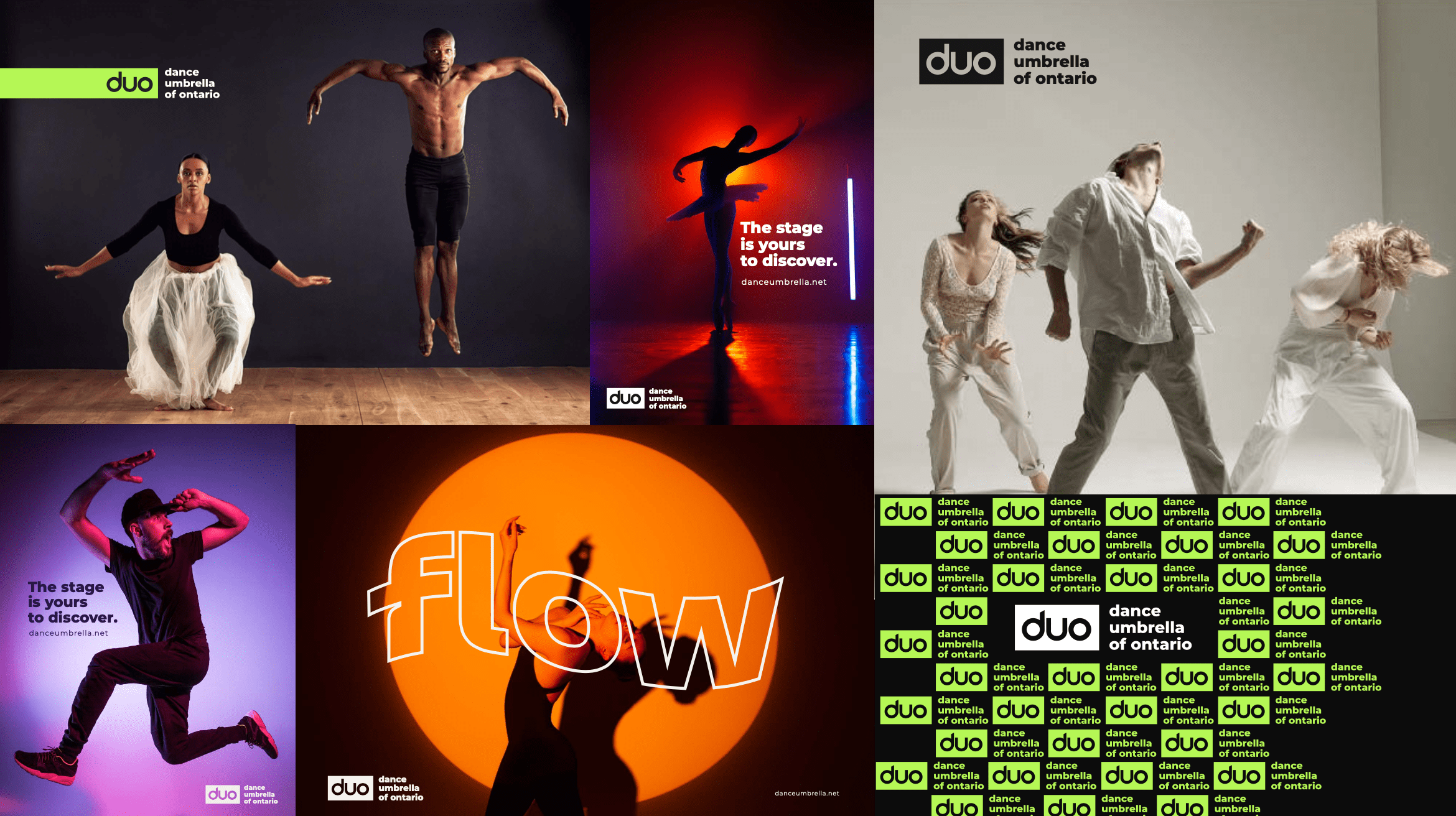
Colour Palette
Borrowing directly from the official brand colours; rich blacks, bright vibrants, and energetic supporting tones, the palette builds a visual personality that is creative, bold, and highly recognizable. This palette reinforces contrast, accessibility, and visual uniformity.
Typography
The Montserrat family was chosen for its clarity, versatility, and modern tone. Used across both logo and text applications, it creates hierarchy, consistency, and a contemporary feel aligned with DUO’s identity.
Patterns & Visual Elements
Leveraging DUO’s icon as a pattern, masking tool, and overlay element introduced expressive graphic possibilities. These treatments create motion, depth, and flexibility while preserving the core identity.
Voice & Tone
The visual system works hand-in-hand with DUO’s tonal framework:
Professional but approachable
Confident but warm
Knowledgeable but inclusive
Energetic but grounded
The identity was developed to support these traits visually, especially through colour, motion-inspired shapes, imagery, and expressive applications.
Design & Develop
Building DUO’s flexible visual system, including their logo suite, colour palette, typography, and motion-driven elements for consistent use.
From the approved direction, I developed a full visual identity system aligned with both DUO’s strategic goals and the detailed standards outlined in the brand guidelines.
Logo System
A responsive suite of logos accommodating multiple environments:
Horizontal and vertical logos for structured applications.
Icon-only versions for social media, program visuals, patterns, and overlays.
Text-only logos for clarity-first use cases or small-scale applications.
Clearspace rules, contrast guidance, and usage dos and don'ts were established to maintain visual integrity across all materials.
Colour Palette
Borrowing directly from the official brand colours; rich blacks, bright vibrants, and energetic supporting tones, the palette builds a visual personality that is creative, bold, and highly recognizable. This palette reinforces contrast, accessibility, and visual uniformity.
Typography
The Montserrat family was chosen for its clarity, versatility, and modern tone. Used across both logo and text applications, it creates hierarchy, consistency, and a contemporary feel aligned with DUO’s identity.
Patterns & Visual Elements
Leveraging DUO’s icon as a pattern, masking tool, and overlay element introduced expressive graphic possibilities. These treatments create motion, depth, and flexibility while preserving the core identity.
Voice & Tone
The visual system works hand-in-hand with DUO’s tonal framework:
Professional but approachable
Confident but warm
Knowledgeable but inclusive
Energetic but grounded
The identity was developed to support these traits visually, especially through colour, motion-inspired shapes, imagery, and expressive applications.