Case Study
Creating a logo and brand foundation for The Valley Retreat
Client: Ottawa Valley Ventures
Role: Direction & Design
Deliverables: Logo design & activations
Case Study
Creating a logo and brand foundation for The Valley Retreat
Client: Ottawa Valley Ventures
Role: Direction & Design
Deliverables: Logo design & activations
The challenge
Create a modern, memorable brand for The Valley Retreat that reflects luxury glamping, adventure, and immersion in nature while standing out in a crowded market.
The Valley Retreat needed a logo identity that clearly communicated its position as a modern, glamping destination while standing apart in a crowded and visually similar market. The goal is to capture the essence of eco-tourism, adventure, nature immersion, and meaningful reconnection, while emphasizing that stepping away from the day-to-day and sinking into nature is a one click away.
The challenge was to create a contemporary, trend-forward identity that resonates with millennial and Gen Z travellers, and the brand must feel deeply rooted in its nature setting while remain flexible enough to represent a variety of future accommodation types.
Discover & Define
Researched audience, trends, and competitors to define the brand’s emotional core and key differentiators. Insights informed a nature-rooted identity that resonates with millennial and Gen Z travelers.
In the discovery phase, I focused on understanding The Valley Retreat’s vision, audience, and differentiators to establish a clear foundation for the brand. I explored the emerging expectations of millennial and Gen Z travellers, particularly their desire for immersive escapes, elevated comfort, and experiences that help them disconnect from the everyday with minimal friction.
From there, I conducted a detailed competitive review of the glamping and luxury camping landscape, examining competitor brands such as BackForty Glamping, Birchwood Luxury Camping, Hill Haus, Glen Oro, Rustic Retreat Dome, and Marmora Retreat. This analysis helped identify visual patterns, common clichés, and areas where the market feels saturated, ensuring The Valley Retreat’s identity avoids lookalike design choices and stands out with a point of view that feels fresh, modern, and intentional.
Defining the brand direction involved clarifying the emotional core of the experience: a trustworthy adventure and escape rooted in nature and simplicity.
A screen shot of one of my art boards from my Concept & Direction Phase
The evolution of the logo’s original form being designed from the triangles that make up how geodesic domes are built.
Concept & Direction
Rapid sketches explored triangles, natural landscapes, and geometric forms. Six directions were refined into a flexible, ownable logo emphasizing tranquility, adventure, and modern luxury.
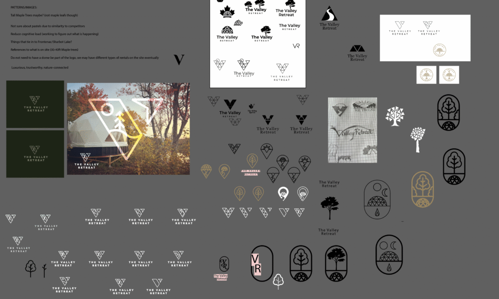
With the strategic foundation in place, I moved into rapid ideation, starting with broad exploratory sketching to capture every possible direction before narrowing in. Working strictly in black and white allowed the focus to remain on form, structure, and brand suitability while keeping future color considerations in mind. This phase was intentionally loose and high volume, ensuring that no potential creative avenue was left unexplored.
From this exploration, I developed six distinct logo concepts and presented each with supporting rationale tied back to the goals defined in discovery. After securing alignment on the strongest three, I refined each direction with more intentional detailing, typography adjustments, and scalable design considerations.
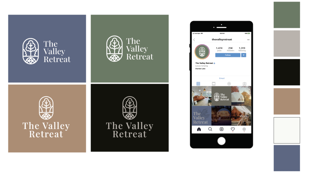
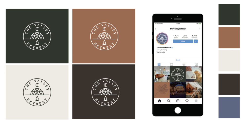
At this stage, I also expanded into color exploration, creating three accessible, nature-inspired palettes informed by the earlier research and competitive analysis. These palettes were evaluated for contrast, usability, and brand fit, ensuring the final identity would not only look elevated but perform effectively across digital and print applications.
This phase ultimately clarified the visual tone for The Valley Retreat logo.
Two out of the three concepts the client narrowed in on.
Concept & Direction
Rapid sketches explored triangles, natural landscapes, and geometric forms. Six directions were refined into a flexible, ownable logo emphasizing tranquility, adventure, and modern luxury.
With the strategic foundation in place, I moved into rapid ideation, starting with broad exploratory sketching to capture every possible direction before narrowing in. Working strictly in black and white allowed the focus to remain on form, structure, and brand suitability while keeping future color considerations in mind. This phase was intentionally loose and high volume, ensuring that no potential creative avenue was left unexplored.
From this exploration, I developed six distinct logo concepts and presented each with supporting rationale tied back to the goals defined in discovery. After securing alignment on the strongest three, I refined each direction with more intentional detailing, typography adjustments, and scalable design considerations.
At this stage, I also expanded into color exploration, creating three accessible, nature-inspired palettes informed by the earlier research and competitive analysis. These palettes were evaluated for contrast, usability, and brand fit, ensuring the final identity would not only look elevated but perform effectively across digital and print applications.
This phase ultimately clarified the visual tone for The Valley Retreat logo.
Two out of the three concepts the client narrowed in on.
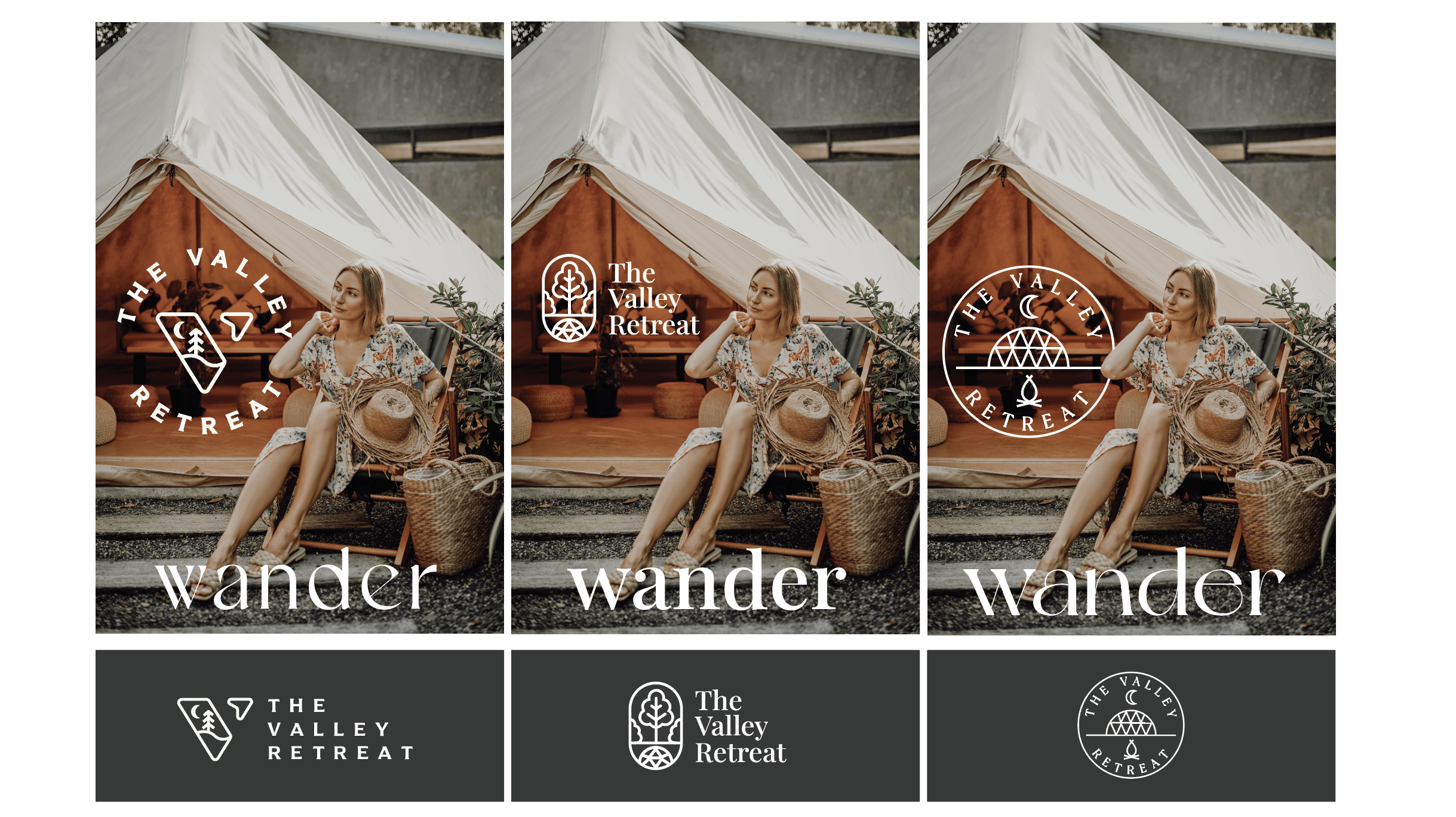
A side by side of all 3 concepts presented to the client.
Design & Develop
Final logo features a triangular “V” with landscape, moon, and tree motifs. Applied color palettes, typography, and mockups across digital and print to ensure a premium, versatile identity.
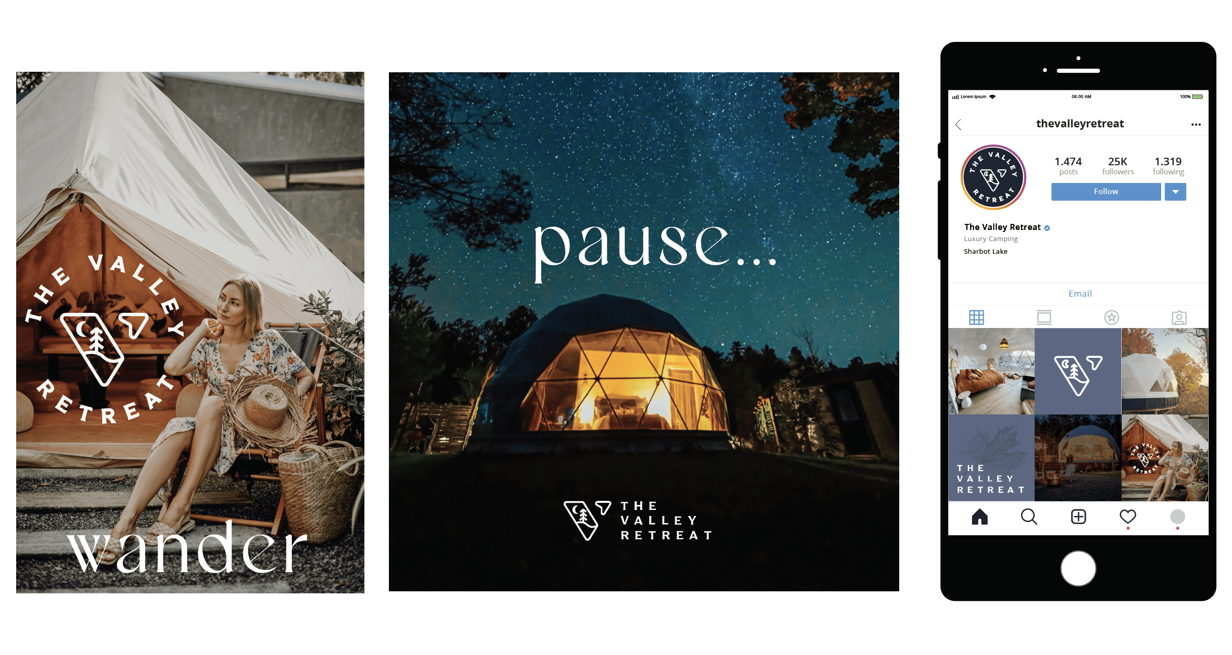
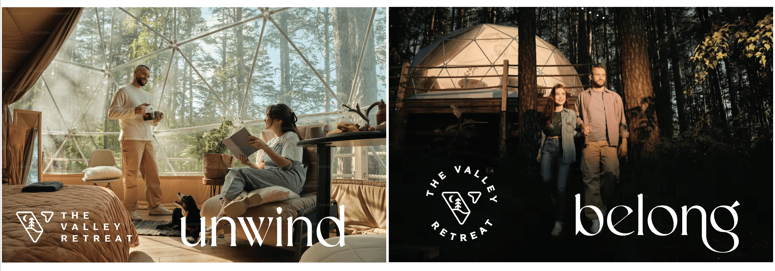
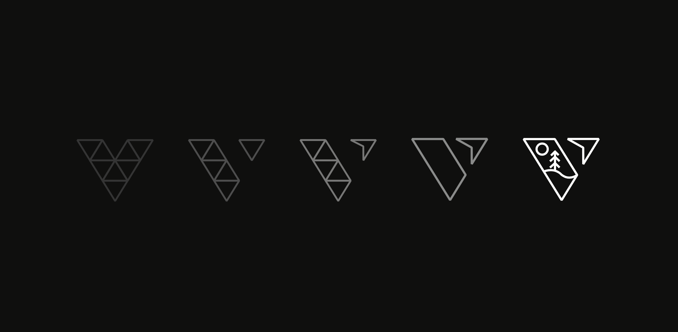
Building on the strongest concept direction, which the owners also unanimously chose, I refined the logo into a distinct “V” form that originates from a series of triangular shapes. This foundation is a subtle nod to the structural geometry of geodesic domes, without visually replicating the dome imagery commonly used by competitors. The result is a mark that feels both intentional and uniquely ownable for The Valley Retreat.
Inside the primary shape, I illustrated a quiet natural scene featuring a moon, a single tree, and a flowing landscape. This composition reinforces the core experience of the brand: tranquility, immersion in nature, and the calm that comes from stepping away from the grind. The minimalist linework keeps the mark feeling modern, airy, and adaptable across applications.
The smaller angled triangle, positioned at the top right of the “V,” serves two symbolic roles. It acts as a directional cue, suggesting arrival, orientation, and the idea of finding your place within nature. At the same time, its sharp, simple form echoes the notion that disconnecting and escaping to The Valley Retreat is just one click away.
Through this blend of geometry, symbolism, and landscape, the final logo achieved a balance of luxury, adventure, clarity, and meaning while remaining flexible enough to evolve alongside future offerings.
Design & Develop
Final logo features a triangular “V” with landscape, moon, and tree motifs. Applied color palettes, typography, and mockups across digital and print to ensure a premium, versatile identity.
Building on the strongest concept direction, which the owners also unanimously chose, I refined the logo into a distinct “V” form that originates from a series of triangular shapes. This foundation is a subtle nod to the structural geometry of geodesic domes, without visually replicating the dome imagery commonly used by competitors. The result is a mark that feels both intentional and uniquely ownable for The Valley Retreat.
Inside the primary shape, I illustrated a quiet natural scene featuring a moon, a single tree, and a flowing landscape. This composition reinforces the core experience of the brand: tranquility, immersion in nature, and the calm that comes from stepping away from the grind. The minimalist linework keeps the mark feeling modern, airy, and adaptable across applications.
The smaller angled triangle, positioned at the top right of the “V,” serves two symbolic roles. It acts as a directional cue, suggesting arrival, orientation, and the idea of finding your place within nature. At the same time, its sharp, simple form echoes the notion that disconnecting and escaping to The Valley Retreat is just one click away.
Through this blend of geometry, symbolism, and landscape, the final logo achieved a balance of luxury, adventure, clarity, and meaning while remaining flexible enough to evolve alongside future offerings.