Case Study
Creating a logo, website and brand guidelines for Bourne Global Enterprises Inc.
Client: Under contract with 1dea
Role: Graphic Design under the Direction of Karen Bonhomme, Creative Director, 1dea
Deliverables: Logo design, brand guidelines & website design. See the website here
Case Study
Creating a logo, website and brand guidelines for Bourne Global Enterprises Inc.
Client: Under contract with 1dea
Role: Graphic Design under the Direction of Karen Bonhomme, Creative Director, 1dea
Deliverables: Logo design, brand guidelines & website design. See the website here
The above is my Adobe XD prototype – it used a combination of lorem ipsum and approved text. See the live website here.
The challenge
1dea was approached by one of their existing clients, Bourne Global Enterprises Inc. (BGEI) to create a logo and brand redesign as well as a new website design.
For this project I was working under a contract with a local design agency in Kingston called 1dea, and reporting to the Creative Director, who vetted and approved all of my work along the way.
Bourne Global Enterprises Inc. (BGEI), a multi-generational family enterprise operating in Canada and Ghana, approached 1dea to refresh their brand and redesign their website. As part of 1dea’s creative team, I was tasked—alongside two senior designers—to develop logo concepts that reflected the company’s deep African and Ghanaian roots while supporting its mission of helping business families build lasting legacies.
The new identity needed to feel culturally grounded, modern, trustworthy, and aligned with BGEI’s core values of family harmony, continuity, and generational sustainability. Once the client selected a preferred logo, I would then develop the full visual identity guidelines and redesign their website.
Discover & Define
Understanding the brand essence.
1dea’s Creative Director and Strategic Director held an in-depth Q&A with BGEI’s founder, which informed a comprehensive creative brief. This included:
Competitor and industry analysis
Key differentiators and value propositions
Challenges with the existing logo
A detailed overview of their service offerings
Brand goals and future vision
Customer lifestyle and behavior insights
Mood boards exploring preferred logos, typography, and color palettes
To ensure cultural authenticity, I conducted additional independent research specific to Africa and Ghana in particular. This included studying traditional symbols, textiles, colour meanings, tribal patterns, and local customs. This research provided culturally meaningful visual cues that shaped my design directions.
Concept & Direction
From concept to creation.
I began with rapid black-and-white sketches to explore broad conceptual territories, eventually narrowing these into five refined directions for internal review. After presenting these to the Creative Director, two concepts were approved for further development.
I then refined each logo, developed corresponding color palettes vetted for accessibility, and produced polished concept presentations. These, combined with concepts from the other designers, were pitched to the client—who selected one of my designs as the final logo for the rebrand.
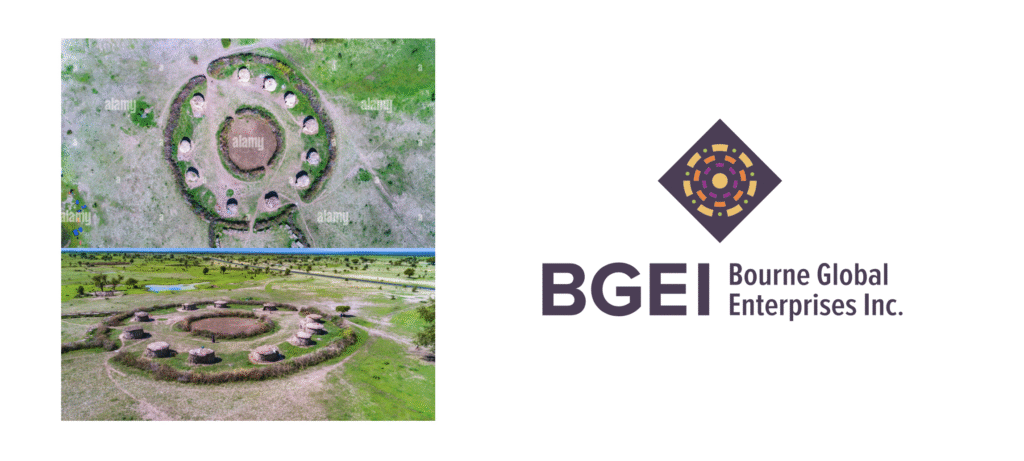
The chosen solution visually represents a multi-generational family:
A central yellow circle symbolizes the founder.
Intersecting rings represent generations working in harmony.
Outer green dots show how each generation stays connected to the core.
This structure drew inspiration from aerial imagery of Ghanaian tribal villages, reinforcing cultural roots while symbolizing community, continuity, and shared legacy.
Concept & Direction
From concept to creation.
I began with rapid black-and-white sketches to explore broad conceptual territories, eventually narrowing these into five refined directions for internal review. After presenting these to the Creative Director, two concepts were approved for further development.
I then refined each logo, developed corresponding color palettes vetted for accessibility, and produced polished concept presentations. These, combined with concepts from the other designers, were pitched to the client—who selected one of my designs as the final logo for the rebrand.
The chosen solution visually represents a multi-generational family:
A central yellow circle symbolizes the founder.
Intersecting rings represent generations working in harmony.
Outer green dots show how each generation stays connected to the core.
This structure drew inspiration from aerial imagery of Ghanaian tribal villages, reinforcing cultural roots while symbolizing community, continuity, and shared legacy.
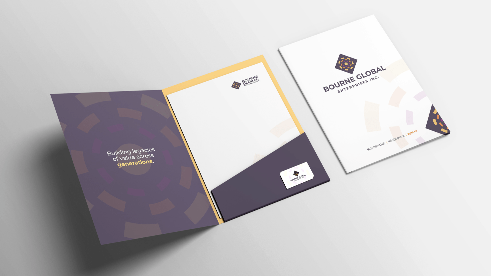
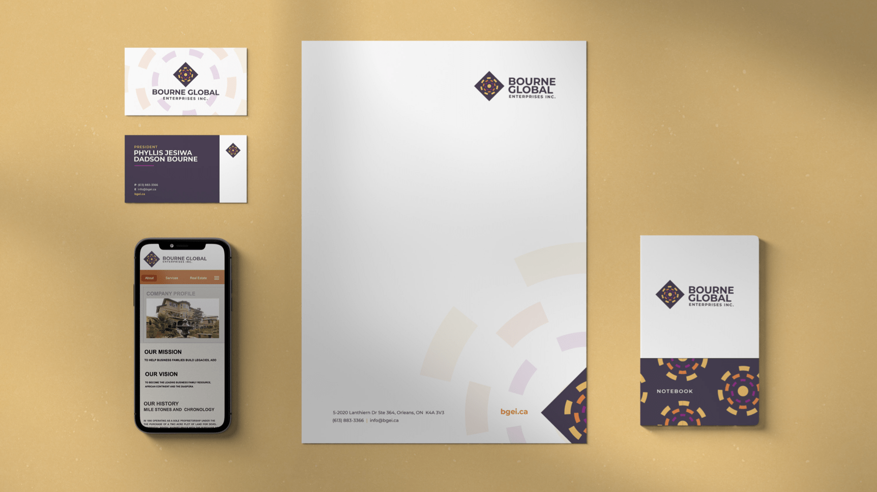
Design & Develop
The final identity system.
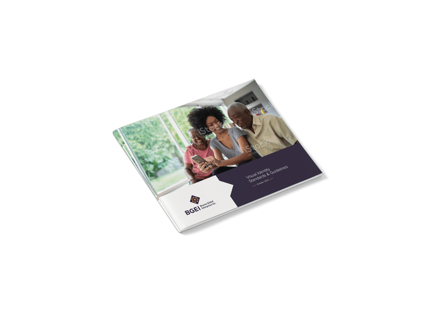
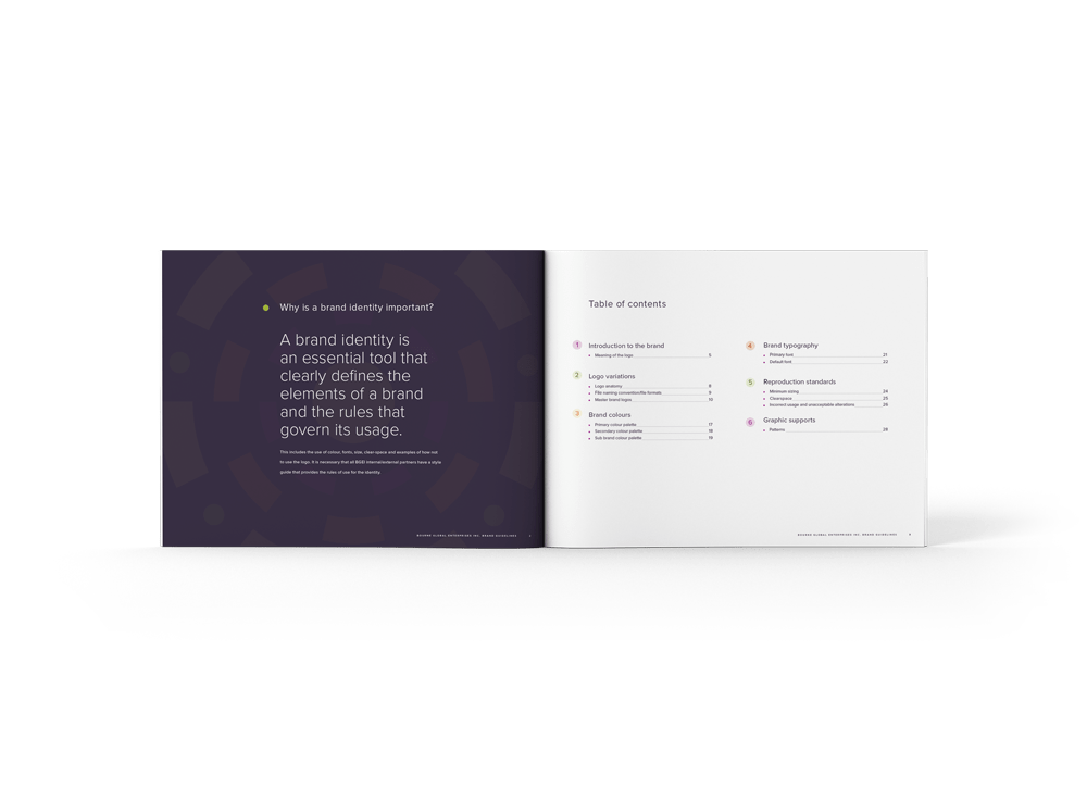
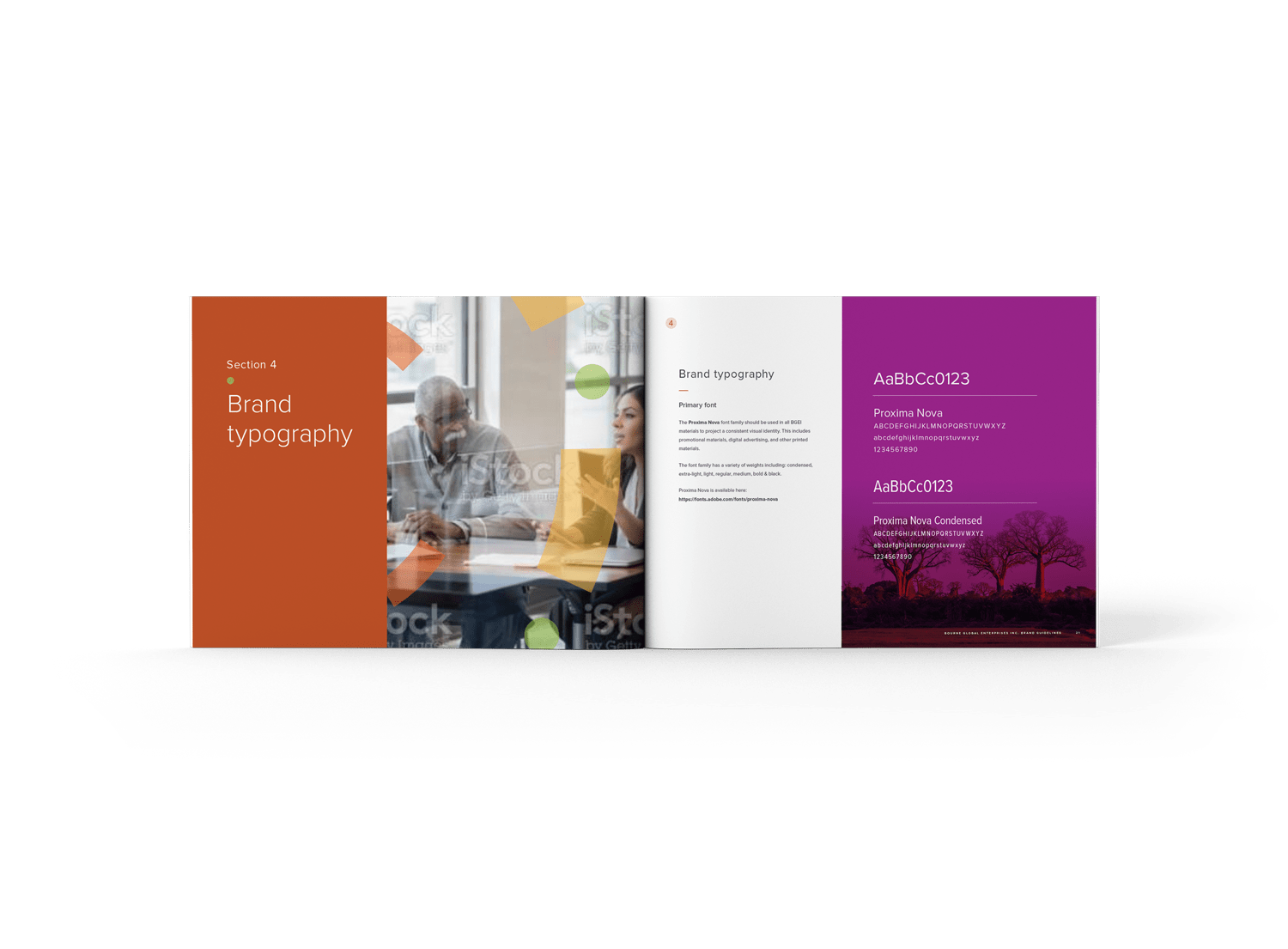
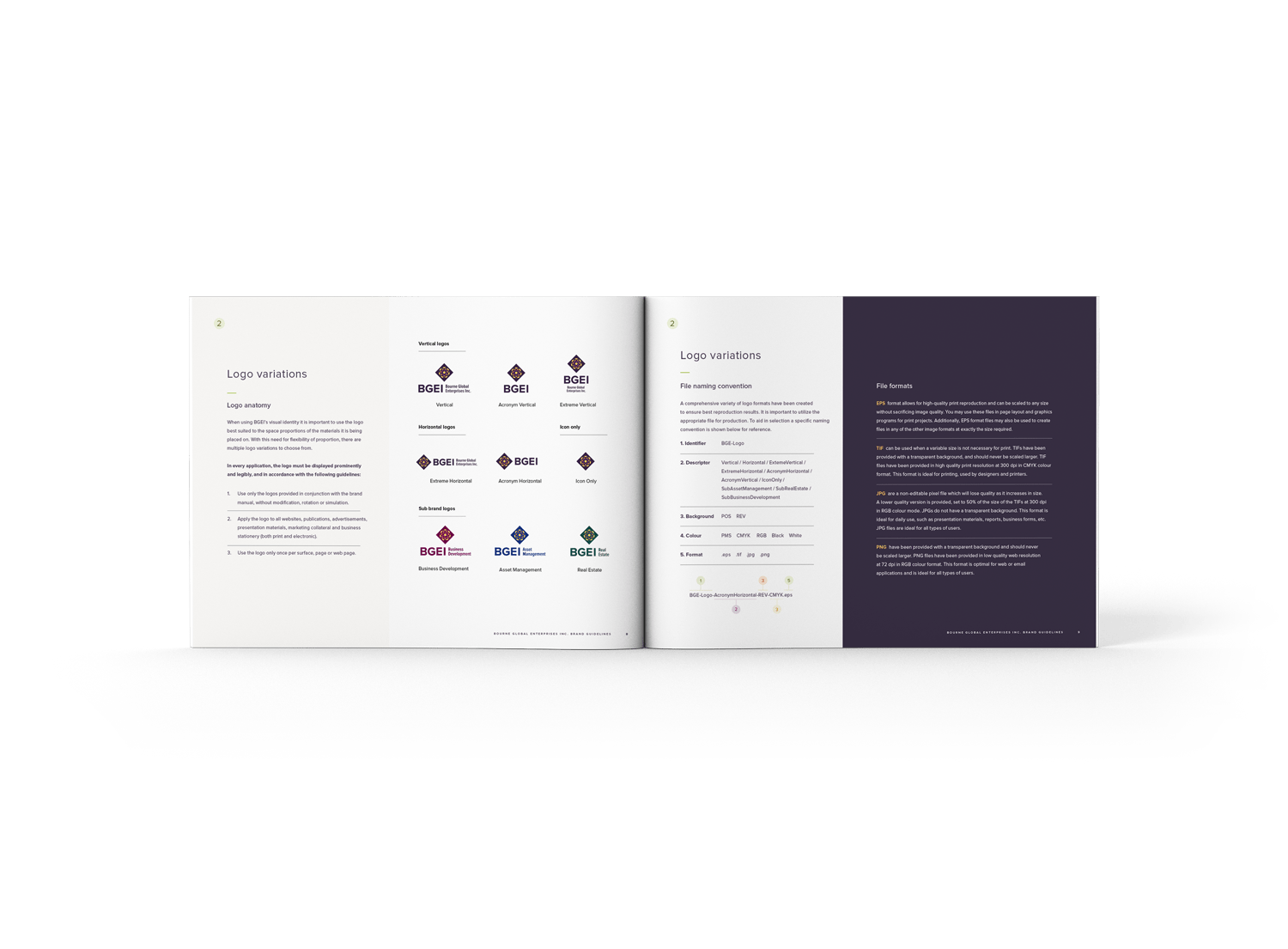
With the approved concept in place, I created a full 29-page visual identity guideline that covered:
Brand introduction
Logo variations and usage
Color standards
Typography system
Reproduction rules
Graphic elements inspired by the logo’s geometry and colors
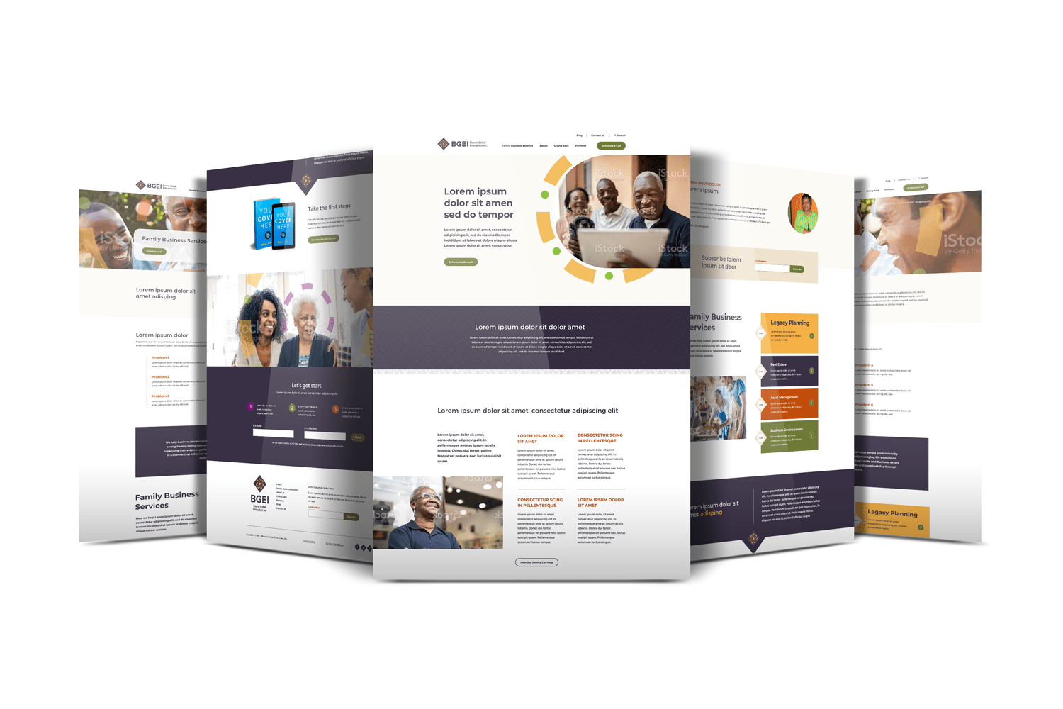
In parallel, I redesigned BGEI’s website. Working from the Strategic Director’s content and site map, I first developed a wireframe focused on UX clarity and accessibility. Once the wireframe was approved by the client, I designed the full website interface using the new brand system, integrating supporting imagery, color, and graphic elements.
All final assets—including the brand guideline, logo package, and website design—were presented and fully approved. The client expressed how strongly the new identity resonated, both visually and culturally, and how well it reflected their values and heritage.
Design & Develop
The final identity system.
With the approved concept in place, I created a full 29-page visual identity guideline that covered:
Brand introduction
Logo variations and usage
Color standards
Typography system
Reproduction rules
Graphic elements inspired by the logo’s geometry and colors
In parallel, I redesigned BGEI’s website. Working from the Strategic Director’s content and site map, I first developed a wireframe focused on UX clarity and accessibility. Once the wireframe was approved by the client, I designed the full website interface using the new brand system, integrating supporting imagery, color, and graphic elements.
All final assets—including the brand guideline, logo package, and website design—were presented and fully approved. The client expressed how strongly the new identity resonated, both visually and culturally, and how well it reflected their values and heritage.