Case Study
Creating a logo and brand guidelines for CanDance Network
Client: CanDance Network
Role: Direction & Design
Deliverables: Logo design & brand guidelines
Case Study
Creating a logo and brand guidelines for CanDance Network
Client: CanDance Network
Role: Direction & Design
Deliverables: Logo design & brand guidelines
The challenge
CanDance Network approached me to create a new and improved logo and visual identity guidelines.
CanDance Network approached me to create a new logo and visual identity that reflected their role as a connector in the dance community. They wanted a clean, corporate feel and explicitly requested that the logo not depict a dancer. The goal was to develop an identity that communicated connection, inclusivity, and growth while remaining professional and versatile for multiple applications.
Discover & Define
Understanding the brand essence.
I began by reviewing CanDance’s website and holding a kickoff meeting to understand how the network operates, its competitors, partners, and overall ecosystem. I compiled a detailed questionnaire for CanDance to clarify their brand goals, including questions about the essence of CanDance, likes and dislikes of the current logo, and the objectives for the new identity.
After the questionnaire was completed, I created a presentation for the Board of Directors that explored various logo styles, font options, and color palettes. CanDance also shared examples of logo styles they liked, helping narrow the stylistic direction and aligning expectations before design work began.
Concept & Direction
From concept to creation.
I started the logo design process with rapid, black-and-white sketches of high-level concepts, exploring a wide range of ideas. These concepts were then refined and presented to CanDance, who selected their preferred direction. Once the concept was approved, I refined the logo, considering both final form and eventual color application.
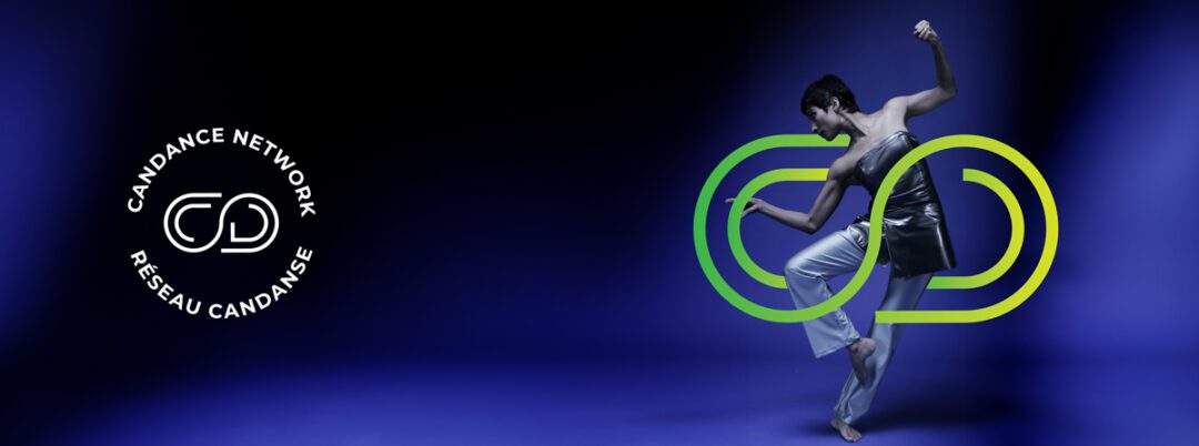
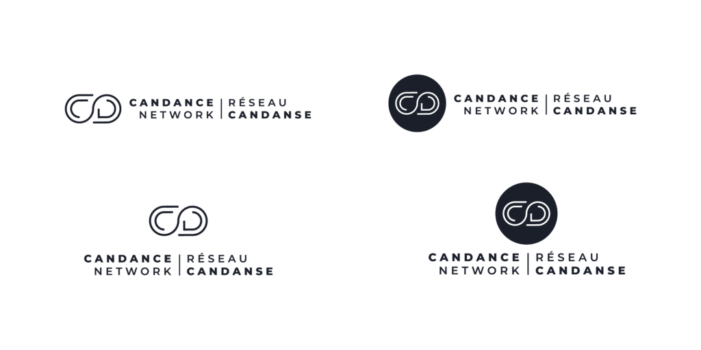
The chosen concept conveys CanDance as the “ever-growing connector”: a stylized infinity symbol that also resembles a linking chain. The design communicates connection, embrace, movement, evolution, inclusivity, stability, and balance. The open ends of the symbol represent inclusivity and collaboration, while the outer lines suggest support and nurturing for the inner letters, C and D.
Concept & Direction
From concept to creation.
I started the logo design process with rapid, black-and-white sketches of high-level concepts, exploring a wide range of ideas. These concepts were then refined and presented to CanDance, who selected their preferred direction. Once the concept was approved, I refined the logo, considering both final form and eventual color application.
The chosen concept conveys CanDance as the “ever-growing connector”: a stylized infinity symbol that also resembles a linking chain. The design communicates connection, embrace, movement, evolution, inclusivity, stability, and balance. The open ends of the symbol represent inclusivity and collaboration, while the outer lines suggest support and nurturing for the inner letters, C and D.
Design & Develop
The final identity system.
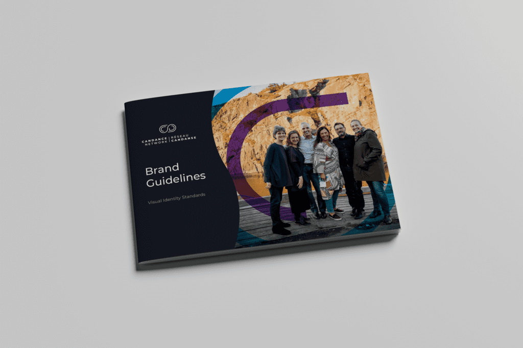
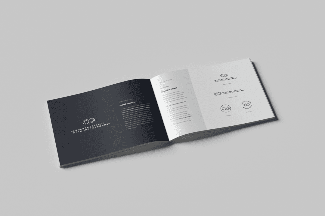
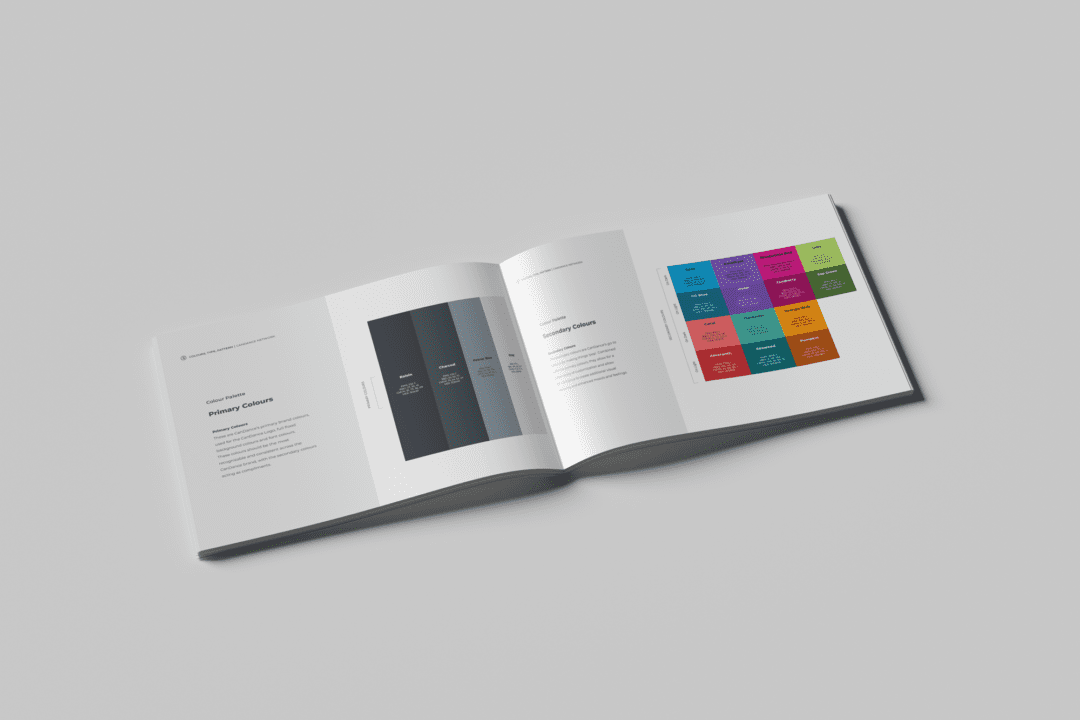
After finalizing the logo, I explored color options compliant with accessibility standards and gained approval on a palette that complemented the identity. I then developed a comprehensive 38-page brand guideline, including brand mission and values, logo essence, logo variations, typography standards, reproduction standards, and social media guidelines.
The new identity was well received by the Board, staff, and external stakeholders. The success of the project led to CanDance inviting me to design their website, which I was unable to take on due to timing conflicts. I continue to maintain a strong relationship with CanDance as their first point of contact for any future branding needs.
Design & Develop
The final identity system.
After finalizing the logo, I explored color options compliant with accessibility standards and gained approval on a palette that complemented the identity. I then developed a comprehensive 38-page brand guideline, including brand mission and values, logo essence, logo variations, typography standards, reproduction standards, and social media guidelines.
The new identity was well received by the Board, staff, and external stakeholders. The success of the project led to CanDance inviting me to design their website, which I was unable to take on due to timing conflicts. I continue to maintain a strong relationship with CanDance as their first point of contact for any future branding needs.